It’s always a pleasure to help out a visionary company working on solving those big global problems. In this case, supply chain diversity in the mining industry.
For New Electric Partners I drilled down into the emotional benefits of the brand, as well as the functional benefits. From these initial discussions this new brand identity was created.
The colours chosen were an important part of the story, conveying the “mining to manufacturing” message. The design needed to be memorable without being flamboyant. I also created the triangle graphic to tie it all together and create a nice cohesive visual language for the brand.
You can connect with New Electric Partners here: linkedin.com/company/newep/
This project was done in Partnership with Studioinc
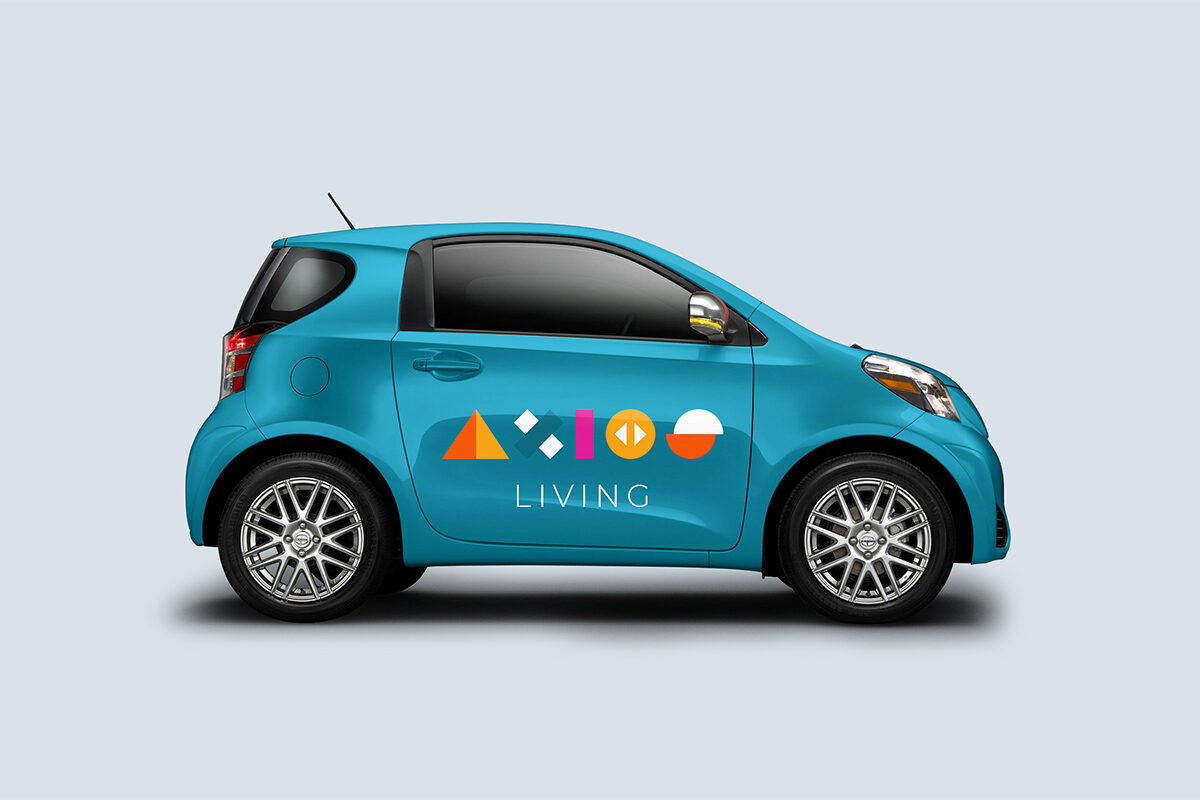


I was commissioned to come up with the name, brand identity and positioning for the company. After doing our Brand Discovery work we uncovered “we help the helpers” as the Brand Essence. Axios Living we found was a company that wants to be less vocal about itself and more vocal about who it helps and why.
The company name, AXIOS comes from the Greek word worthy and reflects the idea that everyone is “worthy” of a good home. The company provides homes for people from all walks of life including the more marginalised members of society.
The shapes and colours of the visual identity reflect the company’s values of inclusivity and diversity. We also wanted the visual identity to fit with the values of our clients too and make them feel, straight away, “at ease” with the brand. The two arrows symbolise the “opening up”of opportunities.


I worked with Dr Peter Macmillan, the founder of Meisterline, from the very start of the Re-Branding & Re-Positioning process. In the beginning we worked together to uncover the Meisterline Brand Essence and Key Narratives and out of that process the KUJI sub-brand emerged too. When we had this all nailed down I helped Peter engage the services of a local Branding Agency (Principle Design) and assisted him in putting together a creative brief for them. As the project has progressed, I have worked on all aspects of the brand, including the KUJI sub brand, designing the UX/UI for the Online Questionnaire. The idea was to take users on a journey and create a unique immersive environment for them. As I write this, we are continuing the roll out of Brand and I’m currently working with the client on Brand Communication and Social Media strategies.


Patons asked me to give their brand a complete overhaul. (except the logotype) Their whole identity and range had become fragmented and there was no longer a clear sense of what the Brand stood for. I thoroughly audited the Brand, researched the market and interviewed customers, staff and retailers. I looked at all the products and the company history and came up with the new brand expression “from Australia with love” We repositioned the Brand to be a celebration of the tastes and flavours of Australia, centred around the Macadamia Nut. I developed the new visual style and created a Brand Bible and style guide for the in-house design team to follow. Retail sales in key locations saw a 40% increase with no additional ABTL advertising.


Flowers Across Melbourne came to me, looking for help in uncovering their Brand Essence & developing a new Brand language. It was an absolute pleasure working with all the florists in this process and I was overwhelmed with great creative ideas for the Brand and its communication. As is so often the case, staff instinctively know what their essence is and it’s my role to identify it amongst all the other ideas and develop it into a complete Brand. The concept of a “living logo” for the Brand identity and “making the world a more thoughtful place” for the Brand Purpose, came out of our work and was developed into a number of Brand Communication ideas.


This was a big one. I lead both Brand Strategy and was Creative Director for 3 years for the Manchester Science festival. I inherited the logo but was given free reign with all the other visual communication. I developed the brand architecture and the key festival themes ensuring both consistency and extendibility, with a wide variety of festival events. The scope of work included printed material, developing the Web Site UI, numerous Environmental applications and advertising material. I worked with festival marketing directors on the communication strategy to provide a 360 degree approach where the best of print, digital and environmental communication all worked seamlessly together for the best visual effect and user experience.


Another project where I got to re-imagine the whole company, what it did and how it worked. I took what was essentially an internal design agency in a large Travel Company and created a new Brand with a focus on maximising ROI for clients. I created a completely new process for events that ensured clients got the maximum out of their investments. I re-positioned the Brand to “upgrade to events 2.0” shifting to more interactive, more personalised, immersive experiences. I developed new Travel Apps for some of Australian’s biggest companies, transitioning them from old analogue thinking to smarter digital processes and methods.


Proportion Foods came to me for help with their Brand Positioning. The logo was developed by local agency B-Brand and my role was to help the Directors through the Branding process. I developed a creative brief out of all the insights and information from their marketing team, for the creative agency to work from. I helped expand the identity B-Brand provided into a full graphic language as well as creating a Brand Bible for the client, containing all the key Brand Narratives for the new Positioning.
I also got hands on with the web site UI too as well as helping out on all the content including Art Directing [Lliam Murphy] the photo shoots.


I worked with REA as well as Australia’s big Banks on a number of Conference Apps. They had traditionally used printed guide books but were open to change and doing things differently. Together we worked through the whole conference and travel experience from a delegates perspective and created a mobile experience that would act as a hub for the whole trip. The Apps became a way to communicate with delegates, for them to connect with each other, share images and lots of other helpful information. It was the proverbial “game changer” for them and became an integral part of all their subsequent events. We templated the design for cost effective implementation while continually adding new feature to improve functionality and user experience.


I worked with Thomas Trussing & their Pixel Range brand from the very start, all the way through to becoming the industry leader. In the early 2000’s, if you were at a big stadium concert, chances were Pixel Range products would have been there. U2, Rolling Stones, Madonna, Blur, all used PixelRange. I positioned the Brand as “Rock & Roll LED lighting” with an emphasis on power, reliability and performance.
I worked on everything form the user interfaces on the products, user manuals, catalogues to international advertising campaigns. I designed their exhibition stands for show in USA, UK and Dubai and won awards for the work.

I have helped hundreds of companies over the years find their unique voice and communicate it to the world. Waaaay too many to cover here.
I’ve stuck to examples of work I have done independently but have 100’s of other examples where I have worked for other agencies as a Creative Director, Brand Strategist, Producer, Project Manager, UX/UI Developer and much much more.
Give me a call if you would like to see even more stuff like this.